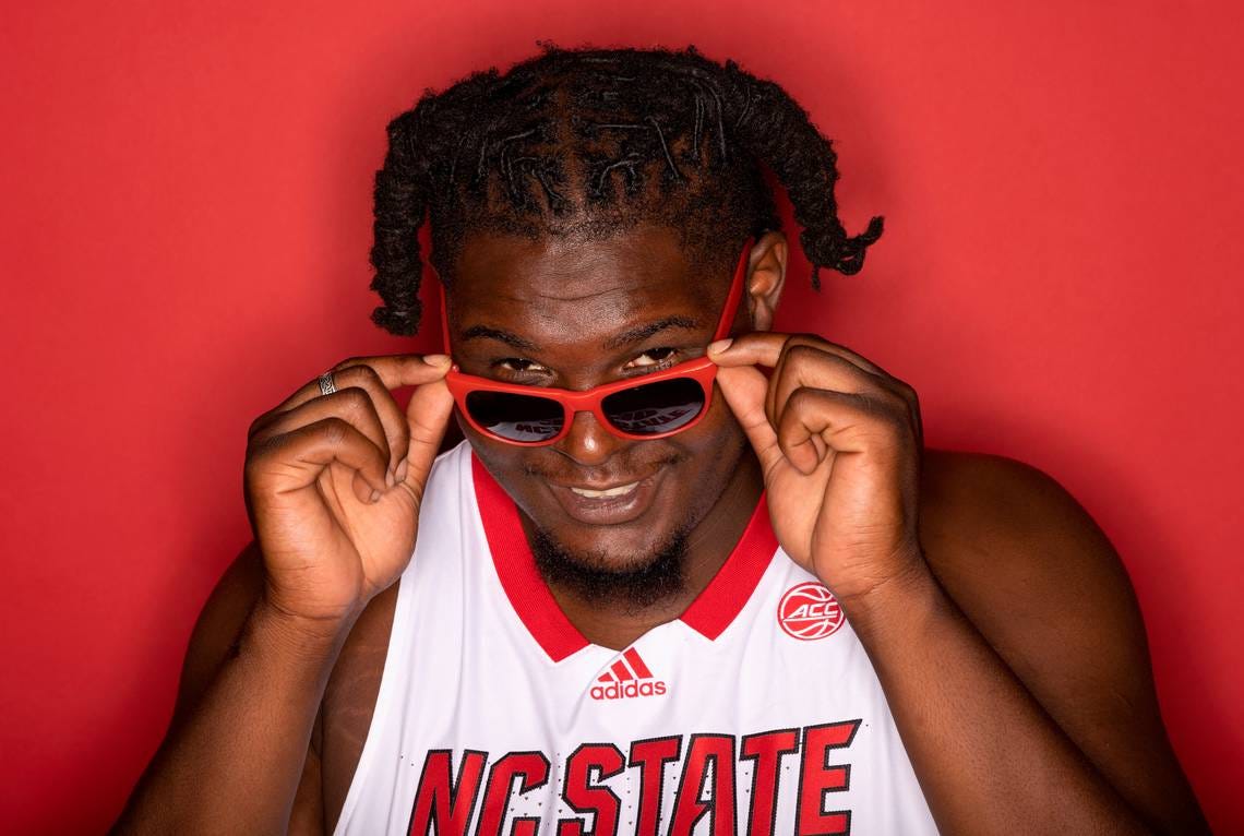
Editor’s note: Substack messed up the formatting on that last email and deleted a photo. We’re not letting our man DJ Burns get played like that.
Howdy everyone. It’s been a minute since our last Sandwich Club. [Insert boilerplate nod towards distraction by other projects and/or personal life, include chuckle of regret.] We hope your Q1s wrapped up nicely, your brackets are still in contention, and your Spring wardrobes are in order. It’s time to come outside prematurely and bask in that sweet freezing April rain.
Duplex Deli is blessedly busy right now, producing a few big-time campaigns with top-notch brand partners that we will be sharing soon, our We Are King series entering post-production (you’ll find it on NBC Sports and The Olympic Channel this fall), and the Sprint series DD proprietor Dan co-EP’d about to drop on Netflix.
As always, we’re finding time to indulge our rabid and omnivorous fandom by cheering on DJ Burns and standing in awe of the overall starpower in WCBB, watching our favorite NBA teams thrive (Dan, Celtics) or collapse (Jon, Knicks) as playoffs approach, and trying to make sense of the UFL. Plus baseball is back, a sport that has been anecdotally observed to lift the overall optimism of its fans at the start of every season.
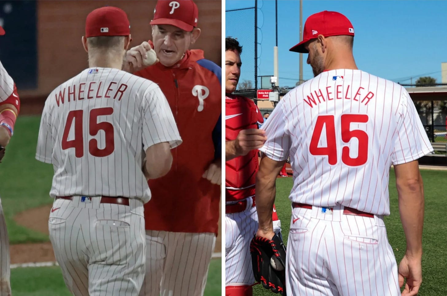
But there’s a big problem. It’s not that the Mets currently have more rainouts than wins. That’s Jon’s problem. It’s the uniforms. And while much fuss has been made about the see-through pants, we don’t really care about the pants (sorry boys). The bigger problem for us fans is that the names on the backs of the jerseys are now, to put it scientifically, super fucking small.
Huh? Why? What a random and terrible change? To what end? To make it harder for young fans to know who to root for? To make an already weird game look weirder? Is it that much cheaper? Fix it, please. And yea, fix the pants too.
Look, hopefully this is just a blip and not the dawn of a newer, lesser era in baseball attire. But it got your Duplex Deli proprietors thinking about another backslide that has nothing to do with fabrics or font sizes and has everything to do with the deeply unsettling and largely self-induced sense of fragmentation and unfamiliarity that pervades our cultural landscape. And it’s currently happening in the most aesthetically pleasurable and jersey-elevating of all the sports: basketball. We love you to death NBA, and have done some of our proudest work as your partners, but allow us, if we may, a brief rant.
THE BREAD
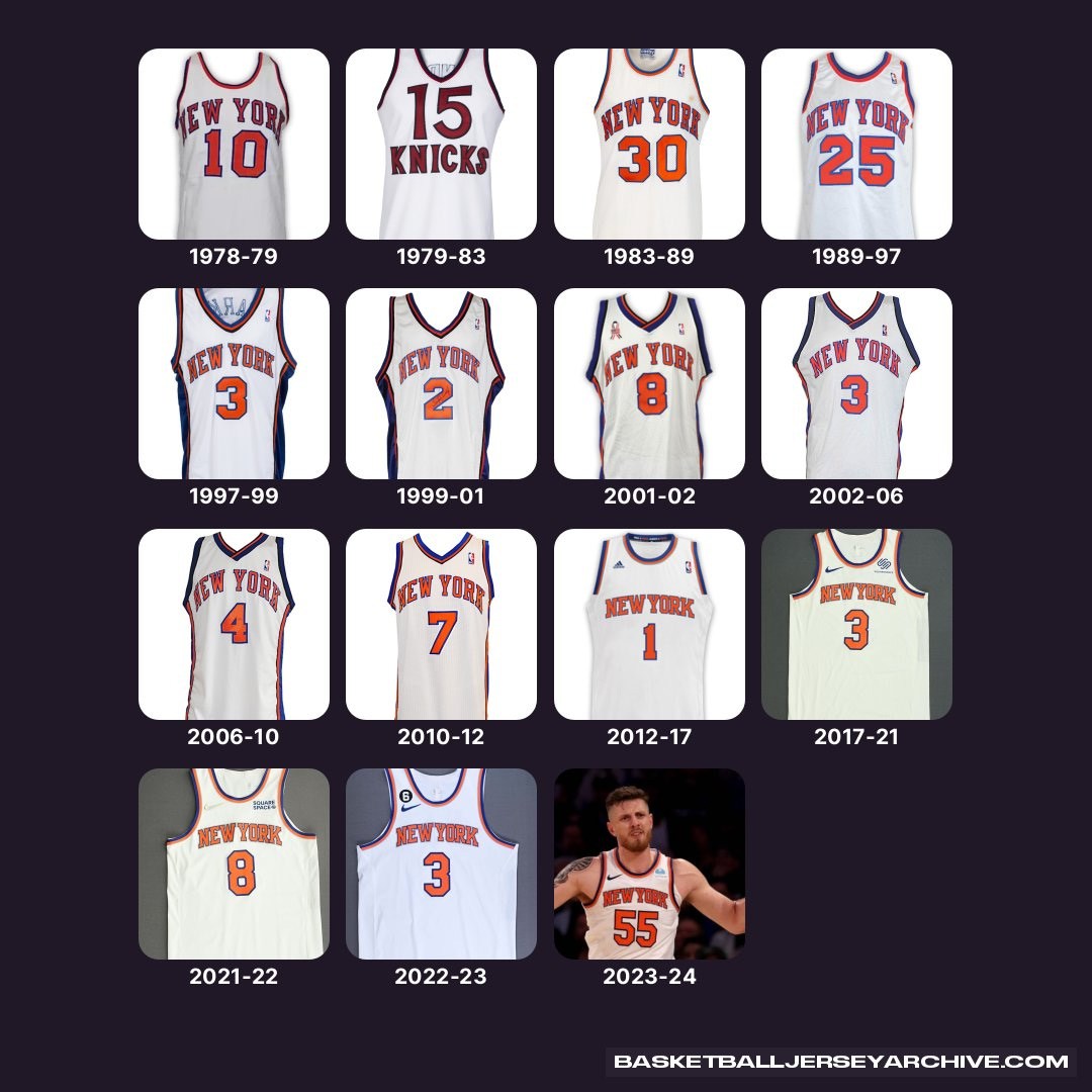
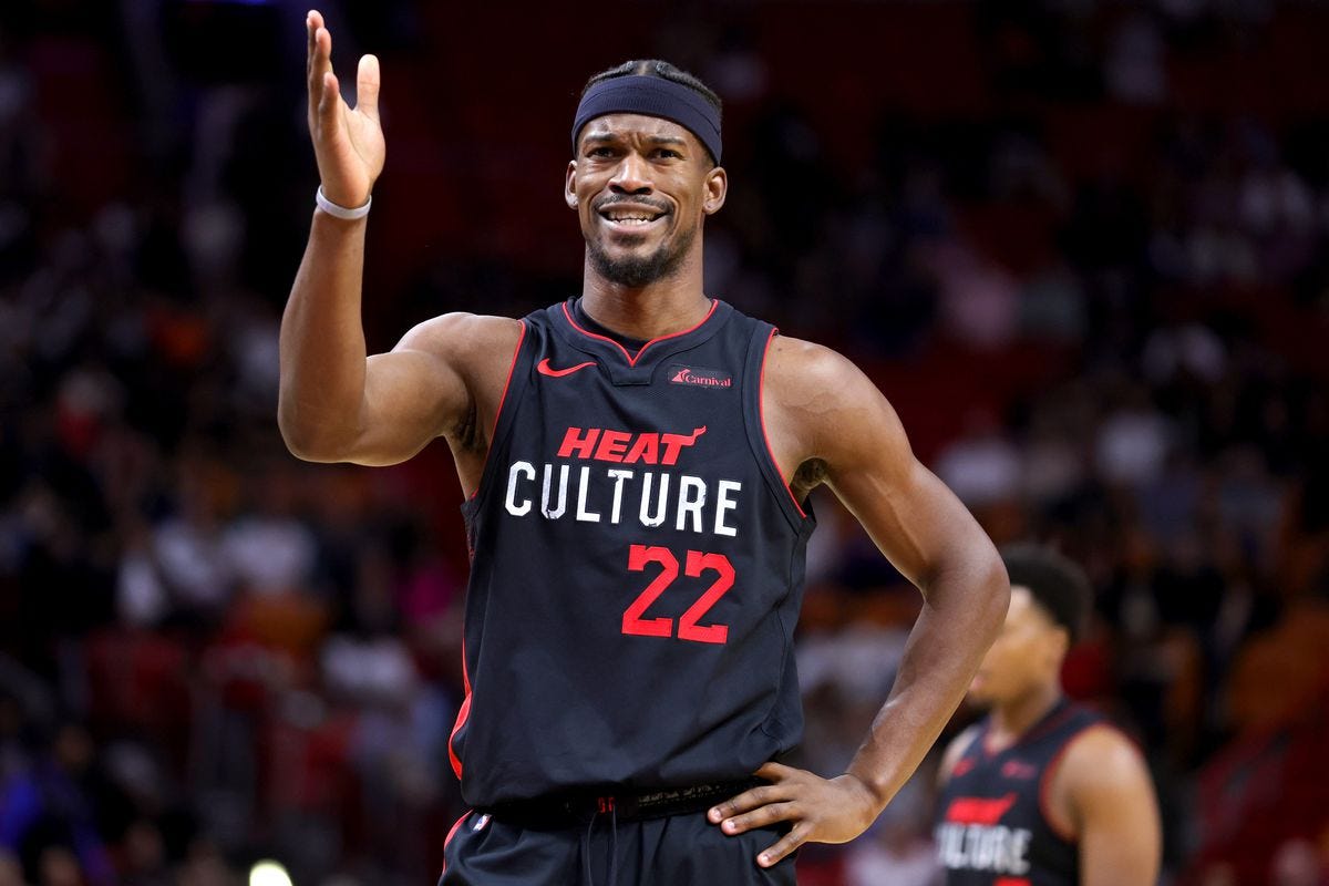
Read the next sentence, then close your eyes for a moment and travel back in time. You once knew what jersey your favorite basketball team would be wearing on any given night. At the risk of dating myself, I remember this vividly. If they were at home: white. On the road: dark. The latter generally a perfect negative of the former. Yin and yang. On extremely rare occasions, a third jersey. The ‘alt.’ Usually pretty sick. Subject to change once in a while, but not often. A thing you could familiarize yourself with; safe deviation from cherished routine. Furthermore these jerseys, over time, changed very little. Only new teams like the Raptors and Grizzlies, untethered from history, had permission to put batshit crazy stuff like raptors and grizzlies on their jerseys. Watching the subtle alterations in the Knicks classic home/away over the years – a sharpened angle here, a bit of black piping there – conjured the Japanese concept of “wabi-sabi” in its appreciation for beauty found in the natural cycle of growth and decay.
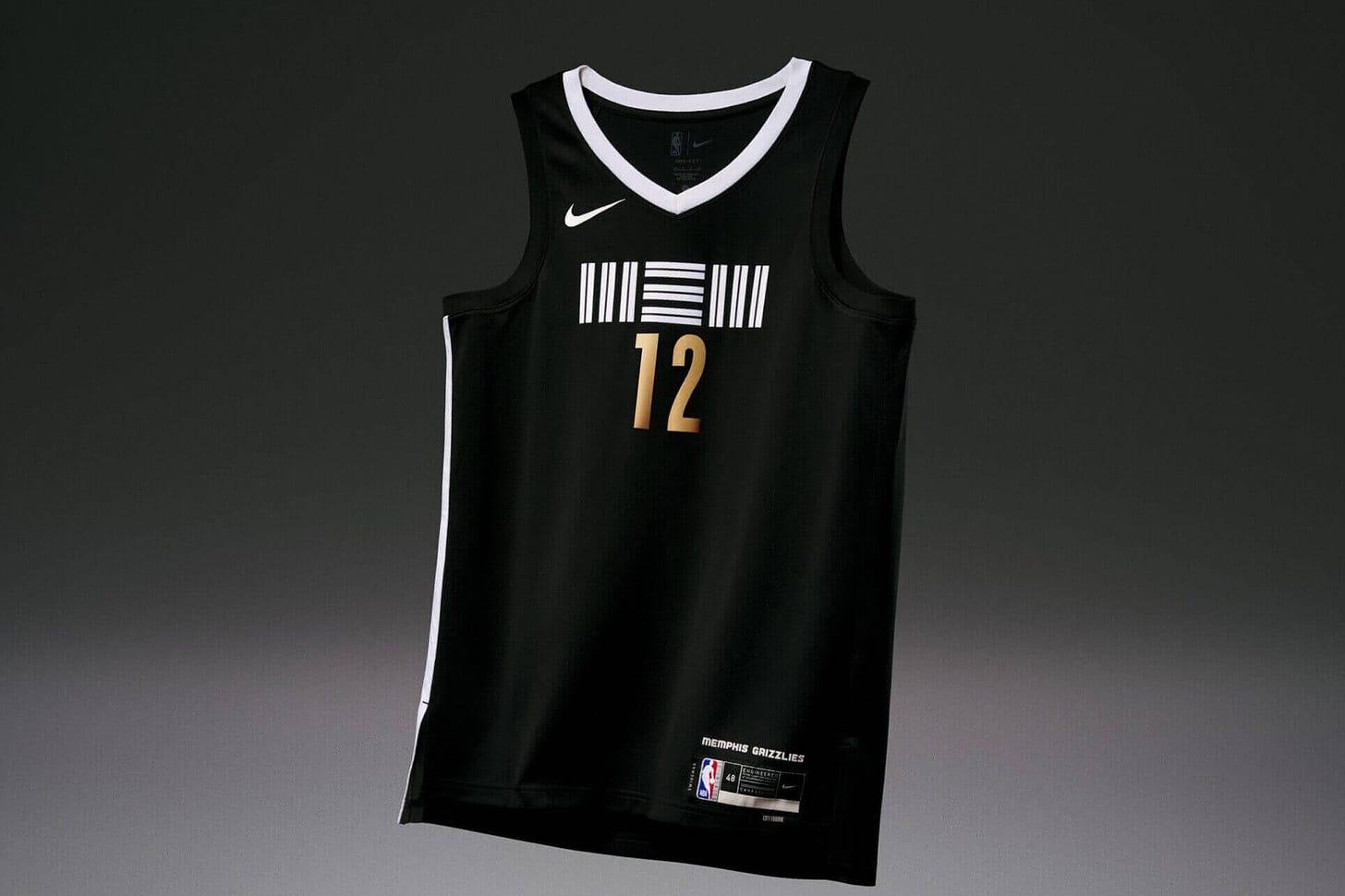
Today: chaos. Seven years ago the NBA blasted through every artifice of tradition and propriety by allowing teams to choose whether they’ll wear white or dark on any given night, regardless of location. Then it went one step further with the introduction of the City Edition jersey. That the nature of the jersey game had forever changed was not obvious at first. The NBA had long experimented with multiple alts. But those alts generally stuck around for years. The architects of the City Edition program, perhaps optimistically believing in humanity’s bottomless ability to come up with jersey designs, or pessimistically knowing AI was coming to do the job, decided there should be a new jersey every year.
The result: a mild but constant uncanny valley that seizes the modern basketball fan when they turn on a game or scroll to a highlight and suddenly realize I have never seen this jersey before. And then you wonder if perhaps you have. And while many of these jerseys are cool from a design perspective, it becomes all too much.
How important is fixing this to the future of our species? We consider the well-documented and long-running love affair between high fashion (aka the people who decide what color blue our sweaters are) and jerseys. And we remember when an archetypal bro of the millennial generation fetishized the obscure basketball jersey as festival attire, which was a little weird, but we fucked with it, especially once Action Bronson turned these references into an art form. Our festival days are largely over but apparently that trend is still going strong.
Jerseys are low-key one of the coolest things about sports. Worn “out of context” they project a healthy regional pride and a respect for others who might share that pride for an entirely different team (outside of a few sadly regressive blood-feud-type areas like Boston.) Every sports fan knows the curious delight that accompanies the spotting of a cool and unexpected jersey in the wild. Jerseys are important, so Duplex Deli’s position is that it’s critical that they stay cool.
What’s next? Petitions? Protests? Staying in the parking lot until Fanatics grants us an extra couple of font points or enough thread count to keep the game G-rated? A State of the Jersey summit at next year’s All-Star Weekend? Wherever it goes, it starts with an open conversation, so let us know how you’re feeling in the comments below.
THE SAUCE
One of the last true joys of the internet is discovering a YouTube video that you cannot believe so few people have watched. We came across one such video as we searched for a link to pay off our nod to Action Bronson above. It is, aptly titled, “All of Action Bronson’s Sports References,” it was uploaded by a man named Tim Goode and it’s the only video he’s ever made (hell of a start there Tim), and it’s got at the time of this writing 44 views, a good chunk of which have come from the writers of this newsletter. Some of our favorites include his extremely bizarre and we think non-sexual reference to former Mets catcher Todd Hundley, his rhyming of Hall of Fame linebacker Mike Singletary and ‘dingleberry,’ and his oddly specific assertion that he “should have been the point guard at Vanderbilt.” Enjoy:
THE MEAT
Another reason fashion is on the brain is that Duplex Deli has been doing exciting work with a few very dope apparel brands in the sports space. A lot of that will be dropping in the next couple of months and we can’t wait to share (you can see a little BTS of one of our shoots with Myles Garrett on MUNICIPAL’s IG right now. Spoiler: one of our partner brands is MUNICIPAL.) But all that work got us reminiscing about some of the great pieces we’ve made with apparel brands in the past. One of which, produced with New Balance, has new relevance today as it’s subject, runner Suldan Hassan, was recently named to the Swedish Olympic team (congrats Suldan!) This is his story as a refugee from Somalia, navigating his new life in Sweden and hoping to run his way to a better life:
We’ll be pulling hard for you in Paris, Suldan.
#IRLSANDWICH
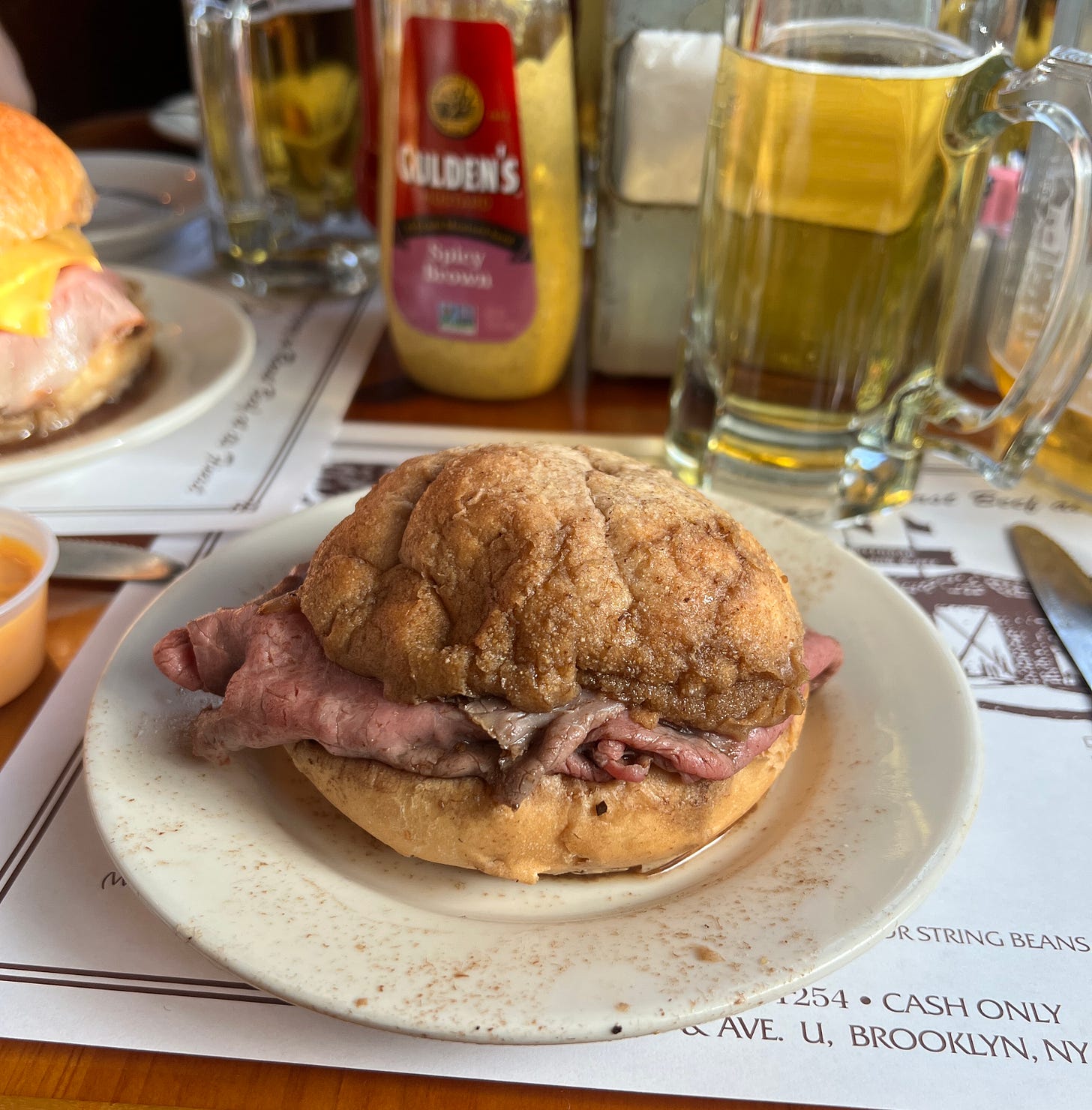
Alright folks, time to wrap this up with another banger of an #IRLSANDWICH you should have on your radar. And for this edition of The Club we are coming back to Duplex Deli’s Brooklyn backyard, and going old school. Brennan & Carr is a Sheepshead Bay institution that has been slinging insanely delicious roast beef sandwiches and Budweisers (the only beer they got) since 1938. There’s something special about eating a sandwich that still costs $9 in an old-timey dining room (described by Eater as looking like “a stockade from the Civil War crossed with an English Tudor cottage”) served by guys in formal white coats. It’s been featured on Man vs. Food, written up in The New York Times, and now it’s made it to Sandwich Club. Feast your eyes, and then take a field trip to South Brooklyn and feast IRL:
Thanks for reading. As always, please don’t hesitate to share the newsletter and/or a sandwich. And if you find yourself in need of creative or production services from a team that exists to harness the profound range of emotions (and great fits) sports storytelling singularly provides, shoot Duplex Deli an email.
See ya at the next Sandwich Club.


